


AnagramBrand Identity & Website
Brand
Interactive
Anagram is a security training company with a radical new approach: build training programs around how people actually learn and work.
Instead of one-and-done training—watch this video, take this quiz, see ya next year—Anagram uses frequent, bite-size puzzles that get employees participating and thinking critically.
The results? Now teams build stronger security habits that they actually remember and use, even at 4:00 on a Friday.
So our mission was clear: position Anagram as the smarter, savvier option—the obvious choice in a category of legacy vendors that check a box but don’t change behavior.
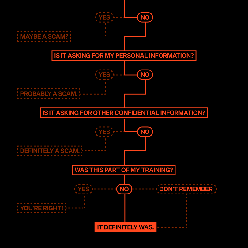
Security awareness training isn’t always an easy sell. It’s hard to hear: you’re probably not as secure as you think. But the industry treats security as an annual milestone, not a daily mindset. That’s where the problem starts.
So our strategy focused on how to best shift perception around security training to build trust in Anagram’s unique, yet proven, approach.
Security awareness training is a hard sell. The bottom line can be hard to hear: You’re not as safe as you could be.
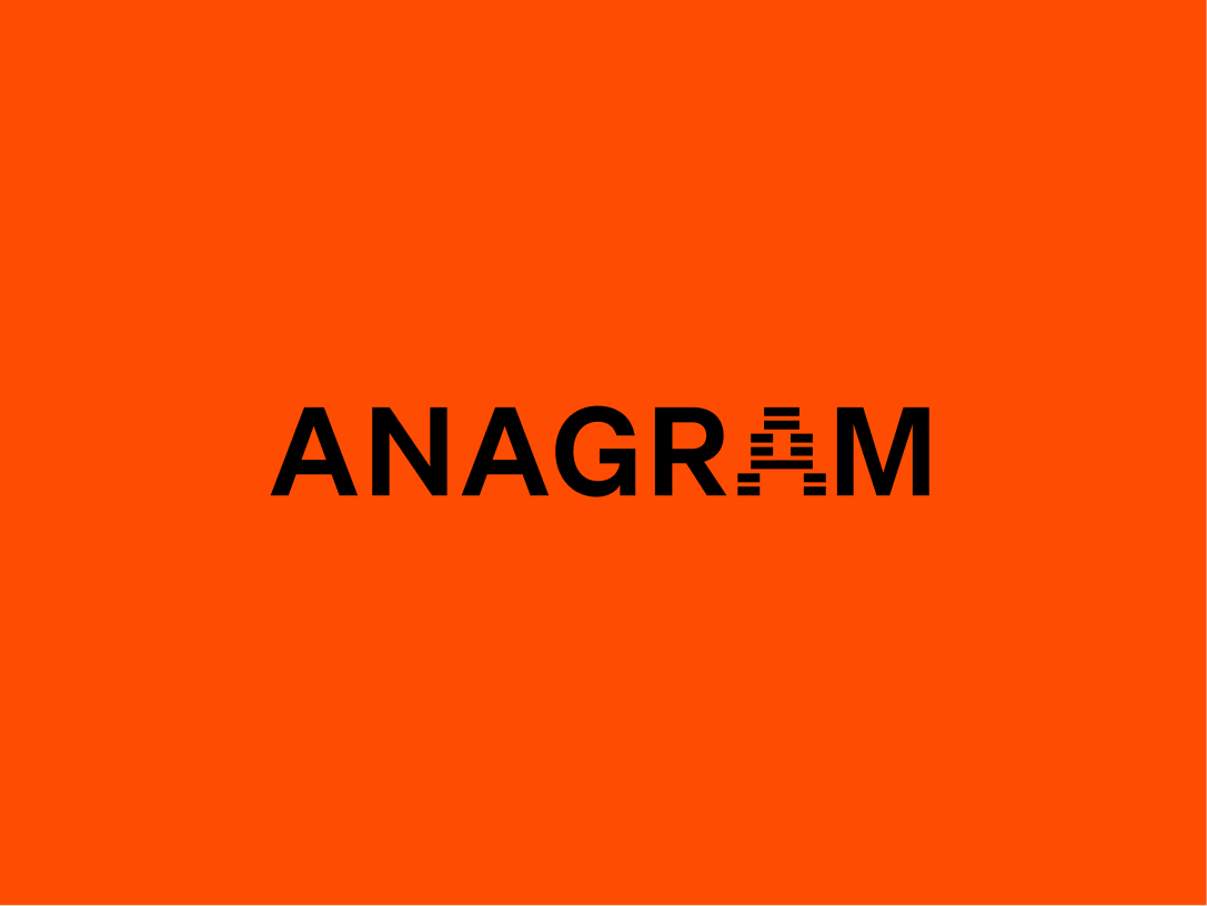

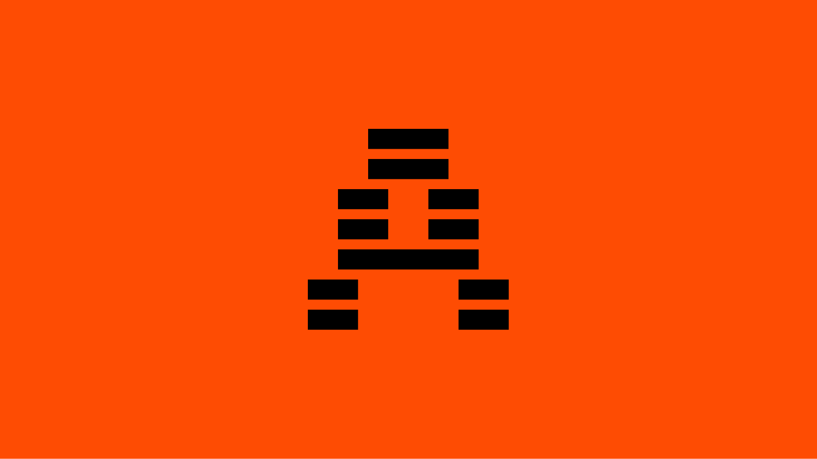
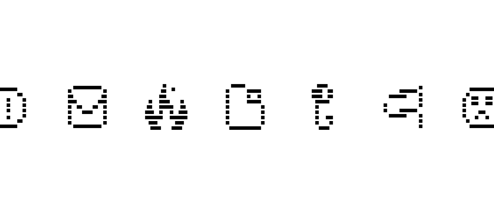
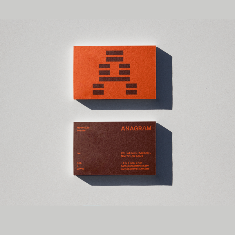
It’s all in the pattern
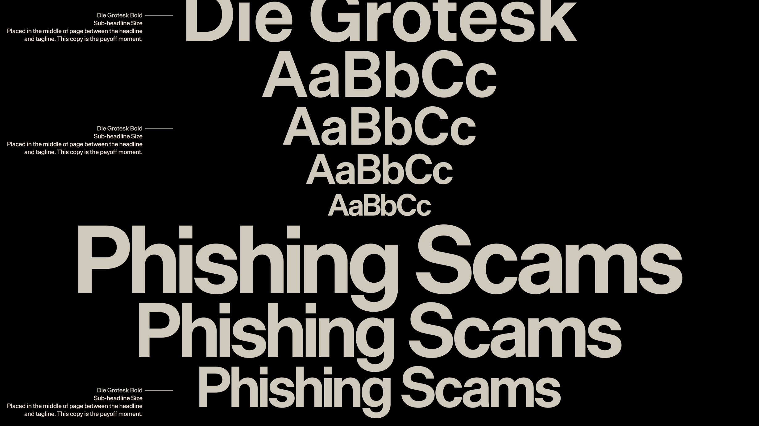
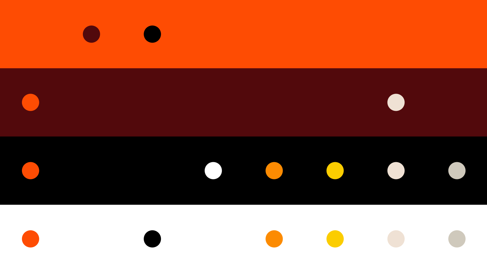
Anagram’s brand needed to feel dynamic and discerning. With their mark, we illustrated their strategy of building knowledge through pattern recognition. Likewise, the straightforward and unapologetic Die Grotesk reflects their clear and direct communication for better learning outcomes. Dark red carries weight without the alarm state connotations of a bright red, and orange signals alertness without danger.
As a result, the brand feels urgent but never hostile, high-stakes but human.
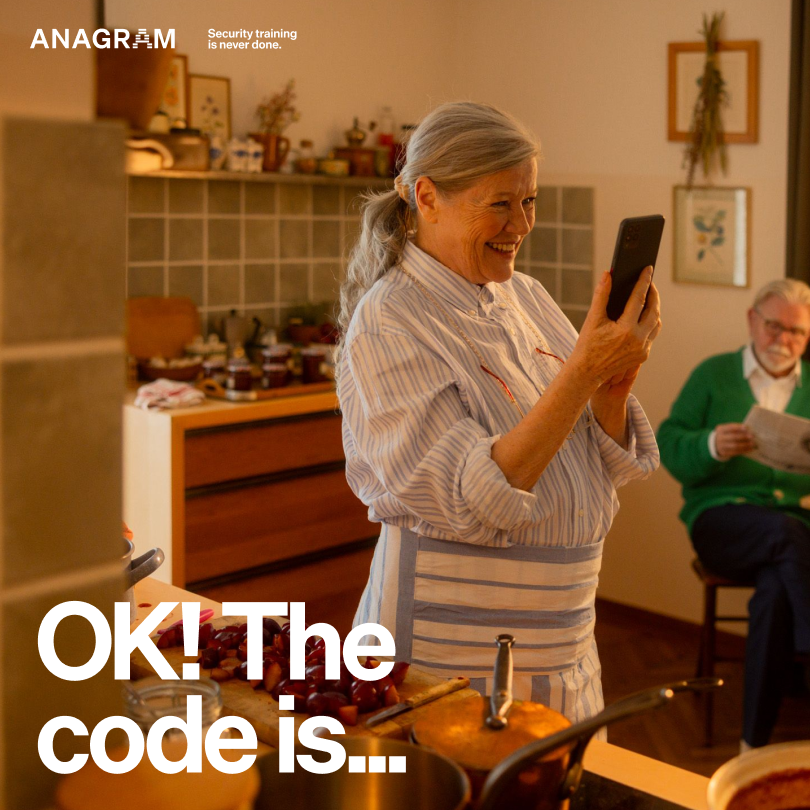

The campaign we created for Anagram shows, somewhat counterintuitively, just how vulnerable technology can make us. If employees aren’t careful, proprietary information can become public knowledge by EOD.
We played with stock photography to depict the moment right before our heroes realize they messed up. The big idea: when work and life are moving fast, people can be quick to trust. But taking that extra second to look closer can pay off big time.


Vintage Vanguards
Say goodbye to New Memphis vectors and hello to an ensemble of “coworker cutouts” guiding you through the website. We took the classic suit-and-tie culture that most security brands embody and flipped it on it’s head. These saturated vintage collages add a sense of warmth and a touch of surreal humor to the experience.
The finished site communicates both the urgency of security problems and the effectiveness of Anagram’s solution. And the new brand delivers on the promise of training that actually sticks. Now Anagram looks and feels ahead of the curve, right where you want your security training partner.
Study Hall
- Executive Creative Director
- Alex Sheyn
- Creative Directors
- Jeremy Volk, Matt Yerman
- Executive Producer
- Monica Reimold
- Producers
- Will Houser, Dani Arama
- Design Director
- Justin Kielbasa
- Senior Designer
- Mortaza Amiri
- Designer
- Tim Rhyne
- Motion Designers
- Gus Votgaus, Trae Sjogren
- Associate Designer
- Dani Grimm, Kayla Ylagan
You might be saying “I need some of this for my business right now.” We get it. It’s your dial 1-800 moment, so click this button to the right and let’s make some great work.
AnagramBrand Identity & Website